Fonction
Description
UX Case Study for an event application
Client
Fonction
Year
2021
Type
UX/UI
Over the years, event planning and hosting have been kind of a struggle for the people involved in it. The recent years have shown us, to some extent that handling invitations and knowing how many people to expect shouldn’t be one of those problems.
With the rise of event apps, some ease has been brought to the event/party planner’s process. While these apps may not plan your events from start to finish, now you don’t really have to bother about invitations or a head count of invitees.
Some of these apps allow you to host, and set your preferred number of invitees. But while these apps have significantly made event planning and hosting easier, the process of hosting these events and keeping track may have become a little more difficult as they progressed.
I was tasked with designing an event app, Fonction. Fonction is a platform to discover upcoming events near you and get personalized recommendations.
How I went about it
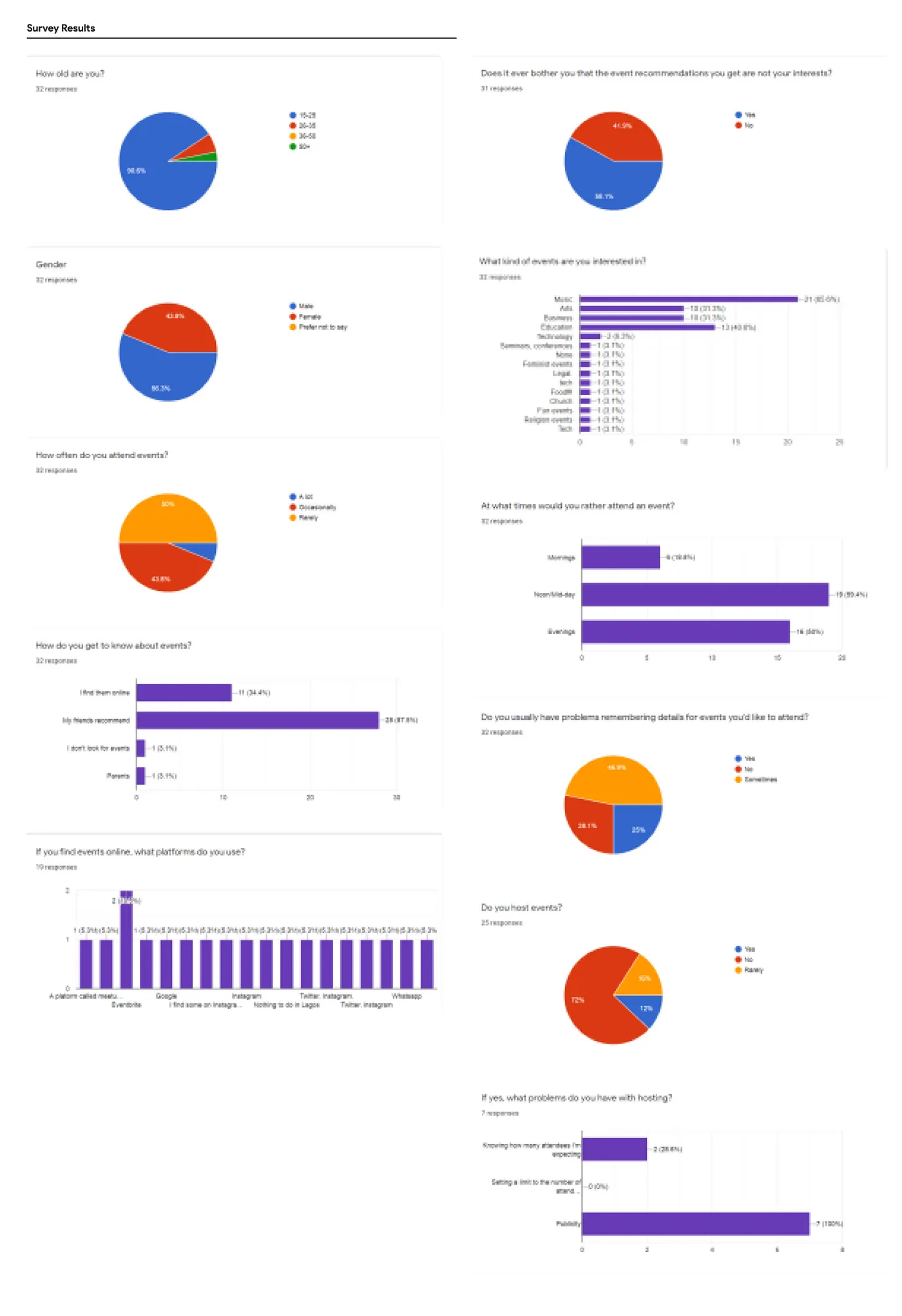
First, I needed to interview potential users, so I set up a form (on google) with questions I needed answers to, to enable me create a product that meets the user’s needs.
The Survey had 32 responses to the 11 questions I had.
From the survey, I developed some key Product Goals:
- To provide a wide and up-to-date catalog of events, with location access for precision in
recommendations.
- To find out users' interests, for more useful and personalized event recommendations.
- For users to be able to share events with friends.
- For users to be able to get reminders for events they are attending via email/push-notifications.
- A distinction between free and paid, and live on-Location and virtual events for users.
- Filtered Searches: For users to find events on their schedule and specifications. (time, location
etc.)
- For users to be able to add events to their calendar
- Accurate specification of event durations.
I found out that for a lot of users hosting events, they wanted a wider reach for their events in specific
fields, and that having to organize and manage all the data involved in event planning proves to be a lot
of work. Also, a lot of users have problems remembering details for events they may have shown interest in.
(These deductions are based on the data collected in my survey).
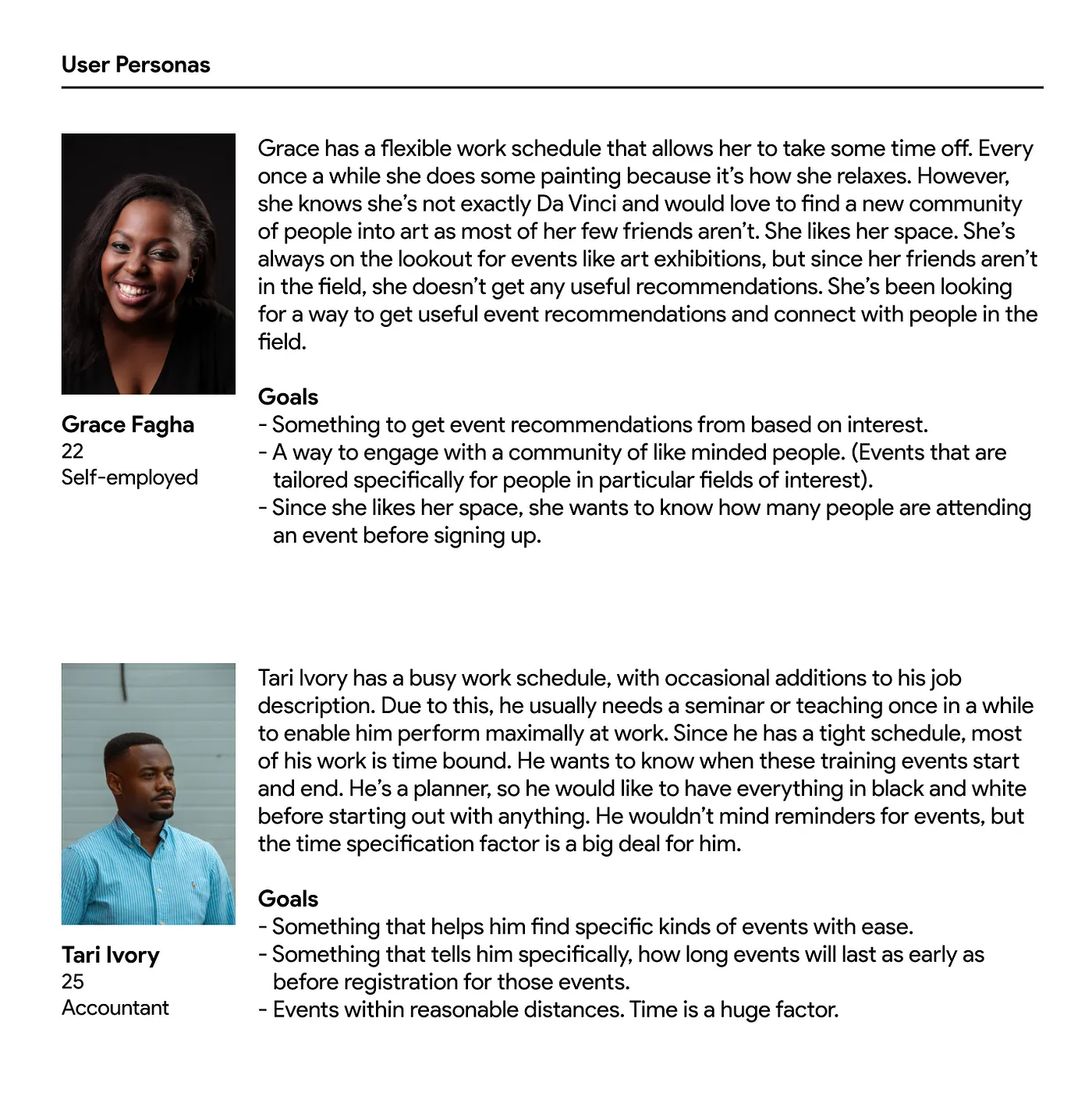
With the information I had gathered so far, I created User Personas. It helped me design the product with an actual user’s problems in mind.
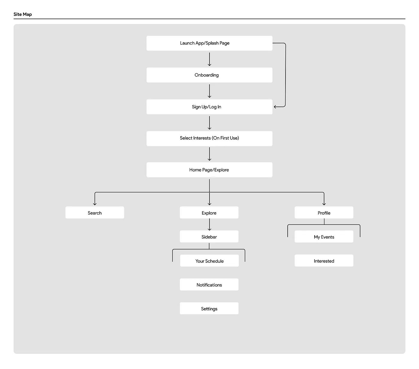
I wanted to give myself an idea of how the app’s navigation should be, so I built a site map after which I proceeded to develop the high-fidelity design and prototype.


